This is where I would normally insert a sparkly statistic about the increase in viewing video on smart phones and tablets, but there is no need because this is old news. Mobile is and has been taking over as the go-to platform for content viewing/sharing and seeking information for a while and it’s only a matter of time until desktops and TV sets are completely replaced with wearables and phones. How does this effect us? A mobile experience on a 3-inch (or smaller) screen is going to be much different than an experience on a 36-inch, standard TV screen or even on a 13-inch laptop screen. In the past, it wasn’t thought to be problematic to have smaller text, or a larger amount of text on screens or to pay as much attention to hard-cut sound between edits. Today, however, producers need to understand the medium itself and what kind of impact it will have on the viewer as well as respond to this mobile experience takeover right now. Building off of a previous post from our own Thad Ciechanowski (Motion Pictures VP), here are some tips on producing video for today’s mobile user.

1. Text – Legibility, clarity and relevance is everything.
Trying to read a paragraph of small text over top of moving video on a three-inch screen is not only hard on the eyes, it sets you up for a definite un-follow. At Apple Box, we try to shrink designs down to about the size of a mobile screen so that we have a constant visual reference. This is an important UX step to consistently implement when designing for the user. It’s important that the size of your text be a little larger than usual as well. The text needs to be easy to read, just like the text on billboards on the highway needs to be big, bold and right to the point. Just as drivers only have a less than a few seconds to read those billboards, mobile users only care enough to lend you less than a few seconds (if that) to try and understand what text is on the screen, why it’s there and why it’s relevant to them. If you must have a decent amount of text, at least stick to a simplified or even a flat background design. For example, in between motion cuts, try having a solid color background under your line of text.
2. Typefaces
If you’re adding text – choose your typefaces carefully. Typefaces can quickly ruin a user’s experience and make them bolt for the “x” button. These are few Design 101 typeface tips we try to keep in mind at Apple Box.
1. Ellipses, ligatures, and diphthongs can improve the aesthetics of your typefaces.
2. Bulleted lists start under the first character, end marks finish an article.
3. There is a place for bulleted lists and it’s more often than not in video.
4. Display and script typefaces may be used in some instances, but they do not mimic handwriting.
5. Bold and italic typefaces have their place, underlined and blinking tyepfaces do not.
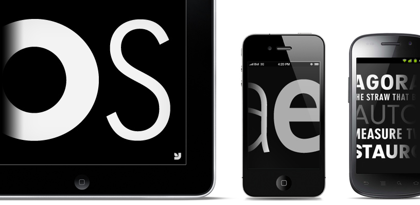
6. If you incorporate numbers, old style numbers improve readability. Old style figures blend in well with lowercase, as they have the same x-height, and also have ascenders and descenders. One of my favorite sites for new mobile fonts is youworkforthem.com (can be seen below from you work

7. Try to avoid stacking type. Stacking letter forms interferes with the way the eye interprets words. Try instead forming blocks with your words. Balanced type is not only easy on the eyes but also pleasing and can lead to extended engagement.
8. Avoid type effects that serve no purpose like distorting type…if you’re about that, then you might as well be using comic sans. Instead of producing effects that just look cool to you, make meaningful decisions for the user’s benefit.
9. All caps should be reserved for sans serif typefaces.
10. Any large text requires kerning, which is adjusting the space between letters. Headlines and other instances of large text require kerning because the large size amplifies the space between letters and can make the text appear awkward. More of an art than a science. Should be uniform throughout.
However, part of achieving great and effective content marketing with mobile video is also figuring out a way to be highly creative and engaging without the use of text. This is where sound, strong visuals and cuts come into play.
3. Sound
Sound or narration is a great alternative to text when dealing with mobile in the video production and post-production process. We are seeing more and more mobile video have close to no text at all except maybe at the end when the brand and a slogan pop up or a name in an interview. The cat food brand Friskies launched a new campaign this past year called Dear Kitten, which has proved to be a definite content marketing win and fitting example. If you haven’t seen the video, check it out below – unless you get weirded out by personifying cats.
The online video campaign now is made up of two videos featuring an older cat gracing a new kitten with its wisdom on its new home with his humans. The second is even more hilarious as it features the new “thing” in the house…a puppy. It’s really just a big ad for Friskies cat food, but the videos are so well done that many do not even realize they are watching an ad for cat food. Back to my point, the only text that appears is at the very end when the Friskies logo appears. During the span of the videos, the older cat’s narration, voiced by Ze Frank, is the only sound playing. The story being told through the cat’s eyes offers a unique and comical perspective that engages the viewer throughout the video. It’s story telling in its natural and original form. Weren’t the best kinds of stories the ones that were read to us out loud? If the content is good enough you get almost lost in a trance following the voice as the story unfolds.
It’s also important to note that mobile viewing experiences also often involve listening through headphones, which is even more of an intimate experience. As Thad also mentioned in his post, speakers on a mobile device and headphones will sound different than in a sound system or a move theater. This means you as the producer or whoever is overseeing the video production process need to listen for things like a hard-cut sound between edits and lose those low end subtleties, which will be lost to the viewer on mobile anyway.
4. Cuts can sting
Cuts are also important to pay attention to in mobile video. When, where and how often you cut in a video can set the tone, feel and pace of any story, especially on a three-inch or smaller mobile device. A critical factor in video production and story telling through this format is the placement of cuts. Thad described his approach, which is to follow Walter Murch’s Rule of six, which is a set of priorities when determining a cut. “You can afford faster cuts than on a big screen when dealing with mobile video. The content has less of a presence than a big screen. The principle behind it is your eyes have less to look at in terms of size. The less you have to move them back and forth, the quicker you can comprehend a concept.”

Editing and design are only part of the mobile video production process of today. The Apple watch may not be coming out until 2015, but it’s only a matter of time before everyone is viewing video on those screens, which are way smaller than the standard smart phone screen size. Like any effective marketing should do, always keep the user in mind. Produce for the user. Produce for their platform…the mobile platform. A great story combined with great user experience sets you up for a content marketing win.
How do you produce mobile first video? Keep the conversation rolling on our Facebook page.