A logo rebrand is more than a facelift; it’s a strategic recalibration of identity. Done right, it refreshes how a company is perceived without alienating loyal audiences. Done poorly, it confuses, frustrates, or erases years of built-up brand equity. The difference often comes down to one question: does the redesign simplify or does it sterilize?
Why Brands Rebrand
Brands evolve because audiences, technologies, and markets change. Logos that once looked bold on print packaging may appear cluttered on phone apps. Modern rebrands often aim for simplicity, scalability, and digital versatility featuring clean lines, reduced details, and flat design that translate across screens. But minimalism isn’t automatically progress; it must still express who the brand is.
The goal is continuity, not reinvention. Visual identity works best when it evolves like a living language, recognizable in tone, but fluent in the current era.
When Simplification Works
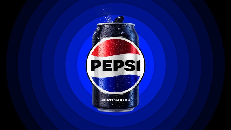
Some of the strongest redesigns maintain core visual cues while modernizing their execution. Pepsi’s 2023 refresh, for example, reintroduced the black wordmark and balanced its globe icon to resemble the brand’s 1990s iteration. This is an update that feels fresh but nostalgic. The redesign celebrated Pepsi’s heritage while future-proofing its identity for digital platforms and energy-drink spinoffs.

Similarly, Burger King’s 2021 rebrand embraced flat design while reviving the 1970s “bun logo.” The rounded typography, warm palette, and simplified form aligned perfectly with the chain’s renewed emphasis on authenticity and “real food.” These updates didn’t chase trends, they clarified what made the brand recognizable in the first place.
When It Goes Too Far
Other rebrands stumble when simplification crosses into disconnection. Cracker Barrel’s 2025 test logo attempted to modernize by removing its illustrated old-country figure and the words “Old Country Store.” The new mark, a sleek barrel silhouette, lost the rustic charm that defined generations of road-trip memories. Public response was swift, many said it felt like “Cracker Barrel without the Cracker.”

A similar lesson came from Tropicana’s 2009 redesign, where the iconic orange with a straw was replaced by a generic glass of juice. Consumers didn’t recognize it on shelves, and sales reportedly dropped 20% before PepsiCo reverted to the old design. These missteps show how quickly a brand can lose emotional connection when visual nostalgia is stripped away.
The Lesson: Evolve, Don’t Erase
A logo doesn’t just represent a company, it holds collective memory. The best rebrands understand that visual history has value. Simplification should clarify purpose, not erase personality.